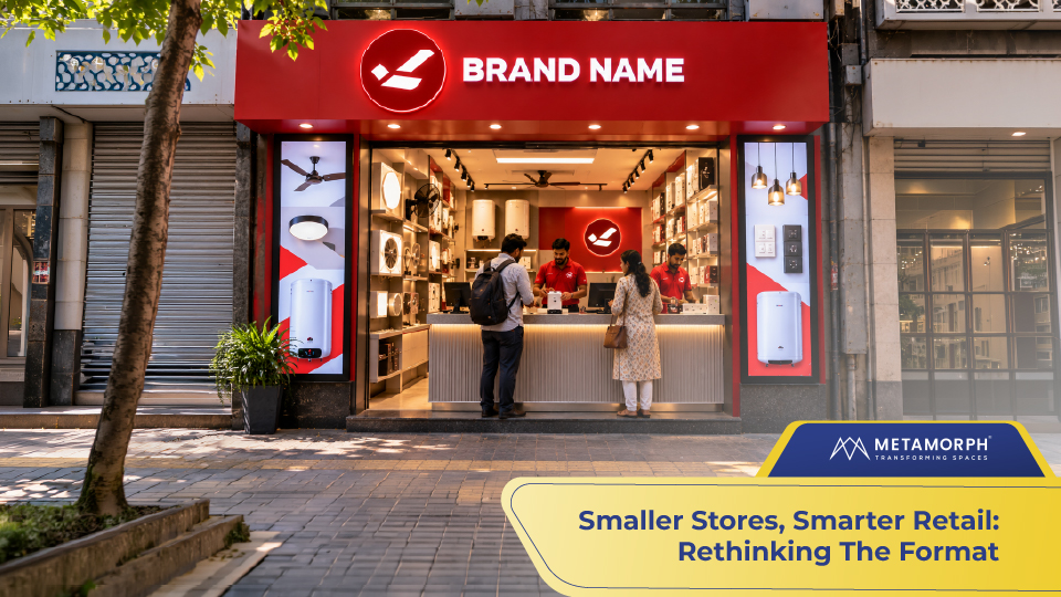
India’s retailers are actively rightsizing. According to Anarock Group, brands are moving away from large flagships towards compact formats ranging between 800 and 2,500 square feet, redesigned around productivity, curation and stronger customer engagement. The Retailers Association of India notes that most retailers now operate with two or three standardised store-size models to maintain consistency across markets.
The format is changing. What has to change with it is how the store is planned.
A store can lose a few square metres on paper and end up requiring an entirely different design. A display that worked comfortably in a larger space might obstruct the entrance in a smaller one. Moving it to clear the entrance could block the primary product range, while shifting that range might leave the storefront with little to draw customers inside. The available space has changed, but the real challenge is how quickly one decision begins affecting everything around it.
This is the question retailers need to address when considering compact formats: what should the store prioritise, and how should its physical environment support those priorities? A smaller footprint demands more deliberate decisions about merchandising, customer movement and brand expression because there is less room to accommodate competing requirements. The aim is to make the space work harder without forcing every part of the retail experience into it.
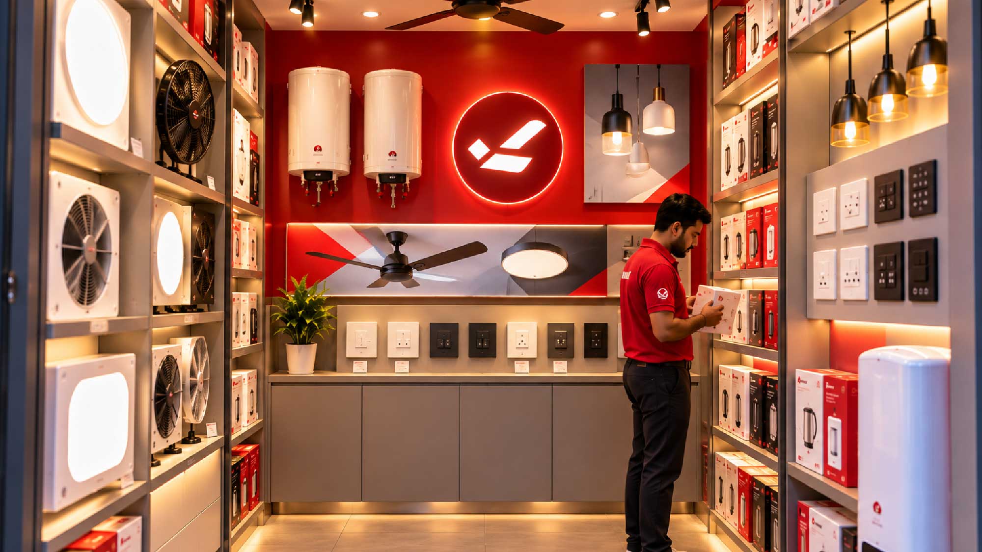
The First Fixture Can Change the Entire Store
Consider a retailer planning a compact store around a particular product category. The initial layout might allocate a prominent position to the main display, leave room for a promotional unit near the entrance and reserve a wall for secondary products. Once the actual fixture dimensions, storage requirements and customer clearances are accounted for, that arrangement may no longer work as intended.
Reducing the depth of a fixture could recover circulation space, but it might also limit how products are presented. Moving the promotional unit could improve movement through the store while making the main display less visible from the entrance. Even a change that appears minor on a drawing can alter what customers notice first and how easily they reach what interests them.
This is why Store Design for a compact format needs to begin with the relationship between functions, rather than a floor plan that simply fits all the requested elements. Product display, storage, customer movement, staff access and brand communication have to be considered together. The decisions also need to account for how the store will operate once it opens, when stock must be replenished and displays have to remain accessible throughout the day.
When the Storefront Has Less Room to Speak
The same constraints extend beyond the entrance. A compact store may have a narrow frontage, limited space for illuminated signage or neighbouring retail units competing for attention. The brand still needs to be recognised, but it has fewer opportunities to establish that recognition before a customer reaches the door.
Imagine a brand opening a small unit in a busy shopping complex. Its primary sign sits above the entrance, but a structural beam reduces the available height and a neighbouring sign competes for attention from the main approach. Adding another panel to communicate the brand's product range might seem useful, yet it could make the entrance harder to read. Increasing the size of the logo may improve visibility from one angle while leaving it poorly positioned from another.
The answer depends on what the storefront needs to communicate first. If recognition is the priority, the main brand identifier may deserve the clearest position, with promotional messages moved inside. If the brand is less familiar to passing customers, a concise product or category cue might help establish relevance alongside the logo. The available façade, viewing distance and surrounding environment determine how those elements should be arranged.
Effective Retail Signage in a compact format therefore begins with a decision about visibility and hierarchy. Letter dimensions, illumination, contrast and placement must work with the actual architecture, while secondary communication needs to support the main message rather than compete with it. Solving those relationships early also prevents a common design problem: trying to recover missing visibility by adding more signs after the storefront has already been developed.
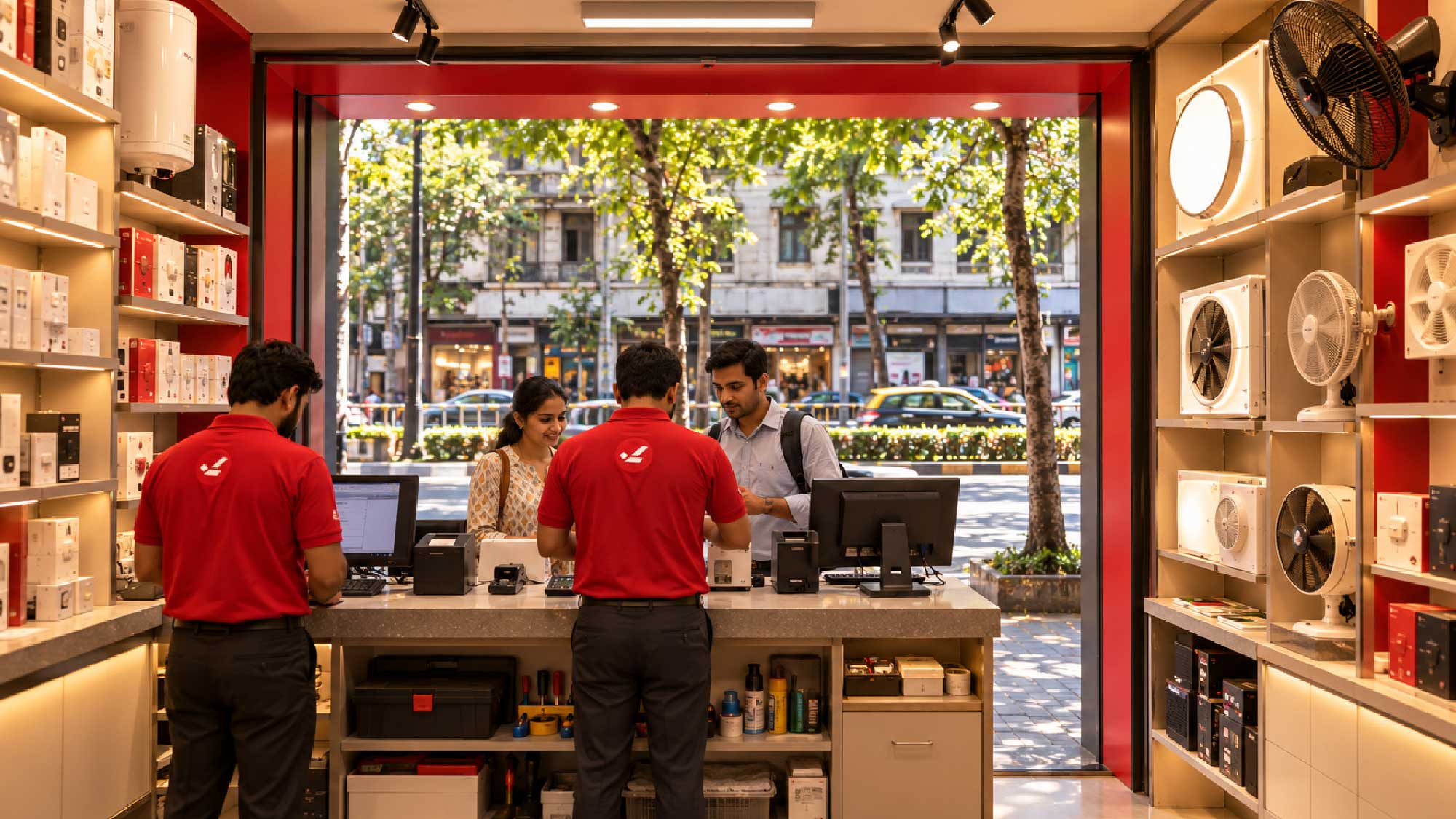
Product Hierarchy Becomes a Decision About What Deserves Space
Inside the store, the same question becomes more specific: which products should customers encounter first, and what should they be able to understand about them?
Consider a compact footwear store carrying several styles, colours and sizes. Giving every style equal display space might make the range appear comprehensive, but it could leave customers with little guidance about where to begin. A stronger arrangement might give the core collection the most visible display, position new arrivals along the natural customer path and keep additional sizes accessible through organised storage. A dedicated area could then help customers compare products that serve different needs, rather than presenting every option with equal prominence.
That hierarchy should reflect how the retailer wants customers to shop. A store built around discovery may give new products and distinctive collections greater visibility. One focused on a narrow, specialist range may devote more space to demonstrating product differences or helping customers compare options. The right arrangement depends on the assortment, the purchase decision and the role of the physical store within the wider retail business.
For Furniture & Fixtures, this means more than reducing dimensions until everything fits. The fixture's height, depth, shelf spacing and access points influence which products remain visible, how customers interact with them and how easily staff can maintain the display. Storage can be integrated where it makes operational sense, but not at the cost of hiding the products the store needs customers to notice.
A compact format benefits from a clear product hierarchy because it gives every display a purpose. The question is no longer how much of the range can be shown at once, but which products need to be seen, compared or handled to make the store work.
Fewer Brand Elements Can Carry More Weight
Once the layout and product hierarchy are established, the brand has to find its place within them. In a larger store, brand communication might extend across several walls, multiple display zones and a dedicated experience area. A compact format may have room for only a few prominent applications, which makes the relationship between those elements particularly important.
A skincare brand, for example, might establish its identity through a clearly positioned storefront sign, a distinctive finish on its main product fixtures and restrained graphics that explain the range. If these elements share a considered visual language, they can establish recognition without requiring every wall, shelf and counter to carry another branded message. The customer can understand the space because its most visible elements reinforce one another.
The material decisions matter here. A highly reflective sign finish may dominate a compact interior under strong lighting, while a fixture with contrasting colours and heavy detailing may draw attention away from the products. Conversely, a consistent material treatment carried from the storefront into selected interior details can connect the environment without repeating the logo at every opportunity.
This is where Retail Branding and In-Store Branding need to be considered alongside the physical layout. Brand identity has to translate into materials, signage, graphics and fixtures that suit the scale of the space and support the way customers use it. The goal is a recognisable environment in which the important elements have room to do their jobs.
Making Every Square Metre Work for the Brand
The success of a compact store is not measured by how much of a larger format can be squeezed into it. It comes down to whether the available space supports the products customers need to see, the movement required to shop comfortably and the brand elements that make the store recognisable.
That requires a connected approach to Store Design, Retail Signage, Furniture & Fixtures and In-Store Branding. Each decision must account for the demands already placed on the space, because adding one more element can change how the others perform.
For retailers exploring smaller formats, the most useful starting point is to define what the store needs to achieve before deciding what it should contain. Once those priorities are clear, the footprint can be planned around them, giving the format its own logic rather than treating it as a reduced version of a larger store.