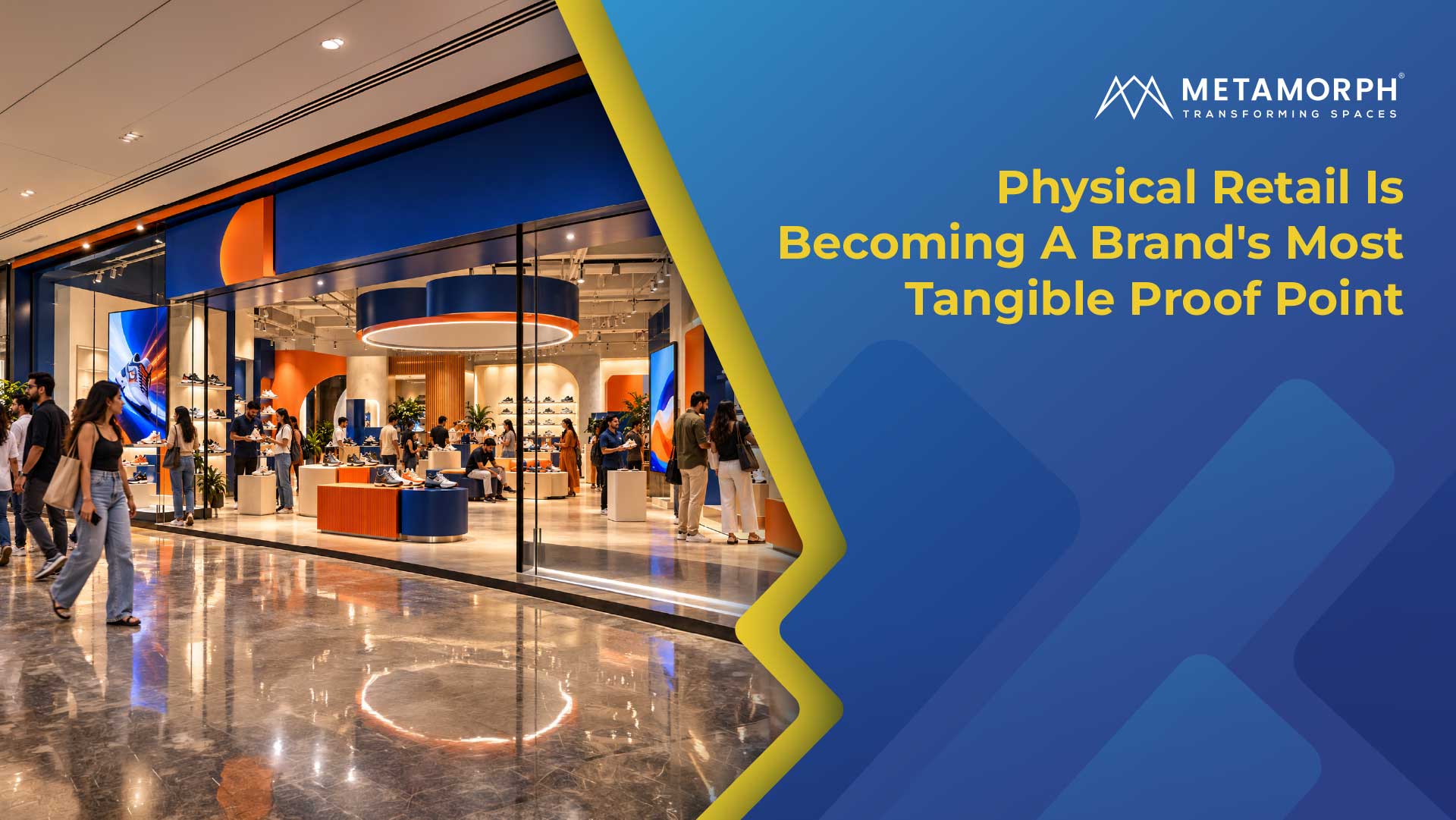
For years, a generation of Indian consumer brands built recognition without needing a physical store.
They met customers through Instagram, marketplaces, their own websites, delivery boxes, digital advertising and increasingly sophisticated D2C experiences. The brand lived on a screen, in a package and in the customer's home. Much of the experience could be art-directed down to the smallest detail. Now, many of these brands are entering physical retail.
That shift creates an interesting moment in a brand's life. A company that was once experienced almost entirely through digital touchpoints suddenly has to express itself through a storefront, a sign, a fixture, a material finish and an environment that customers can physically walk through.
The question shifts from how the brand looks in a controlled digital environment to how that identity behaves when it has to exist in the real world.
For a Retail Branding Partner, this is where the work becomes particularly interesting.
India's D2C Brands Are Entering A New Phase Of Retail Branding
The growth of India's D2C ecosystem has produced brands that were able to establish a strong identity before building a traditional retail footprint. Their first encounters with customers often happened through highly controlled digital environments.
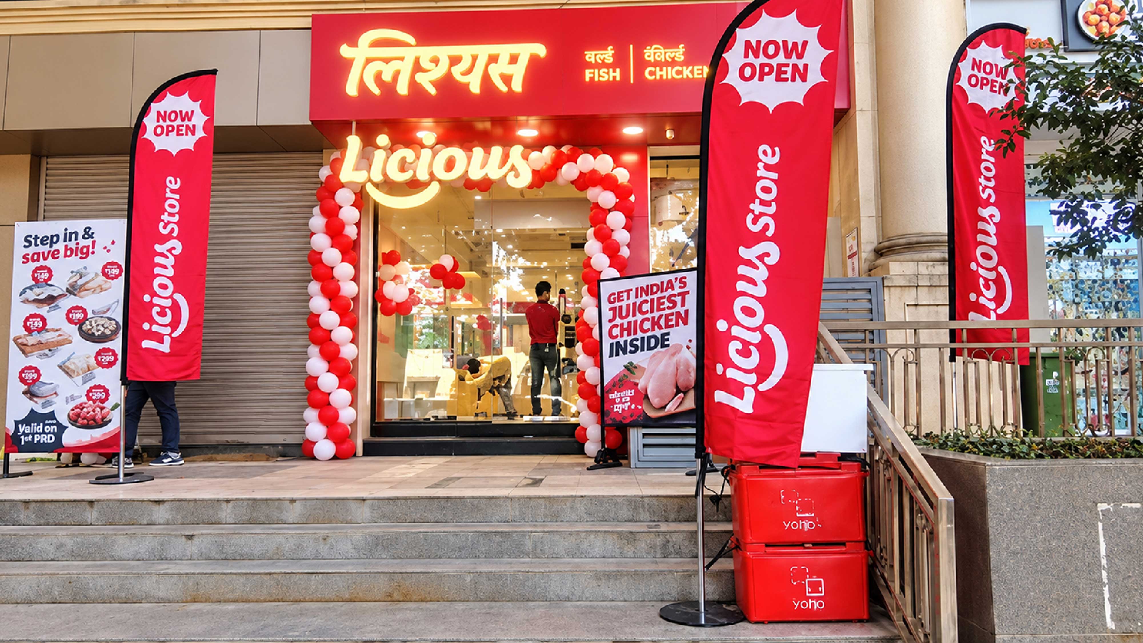
Brands such as Licious and Neeman's illustrate two different versions of this transition.
Licious built a recognisable consumer proposition around buying meat and seafood directly from the brand. Once that proposition enters a physical store, the environment has to make the relationship between product, information and trust immediately understandable. Product presentation, communication and the physical surroundings all contribute to how that proposition is experienced.
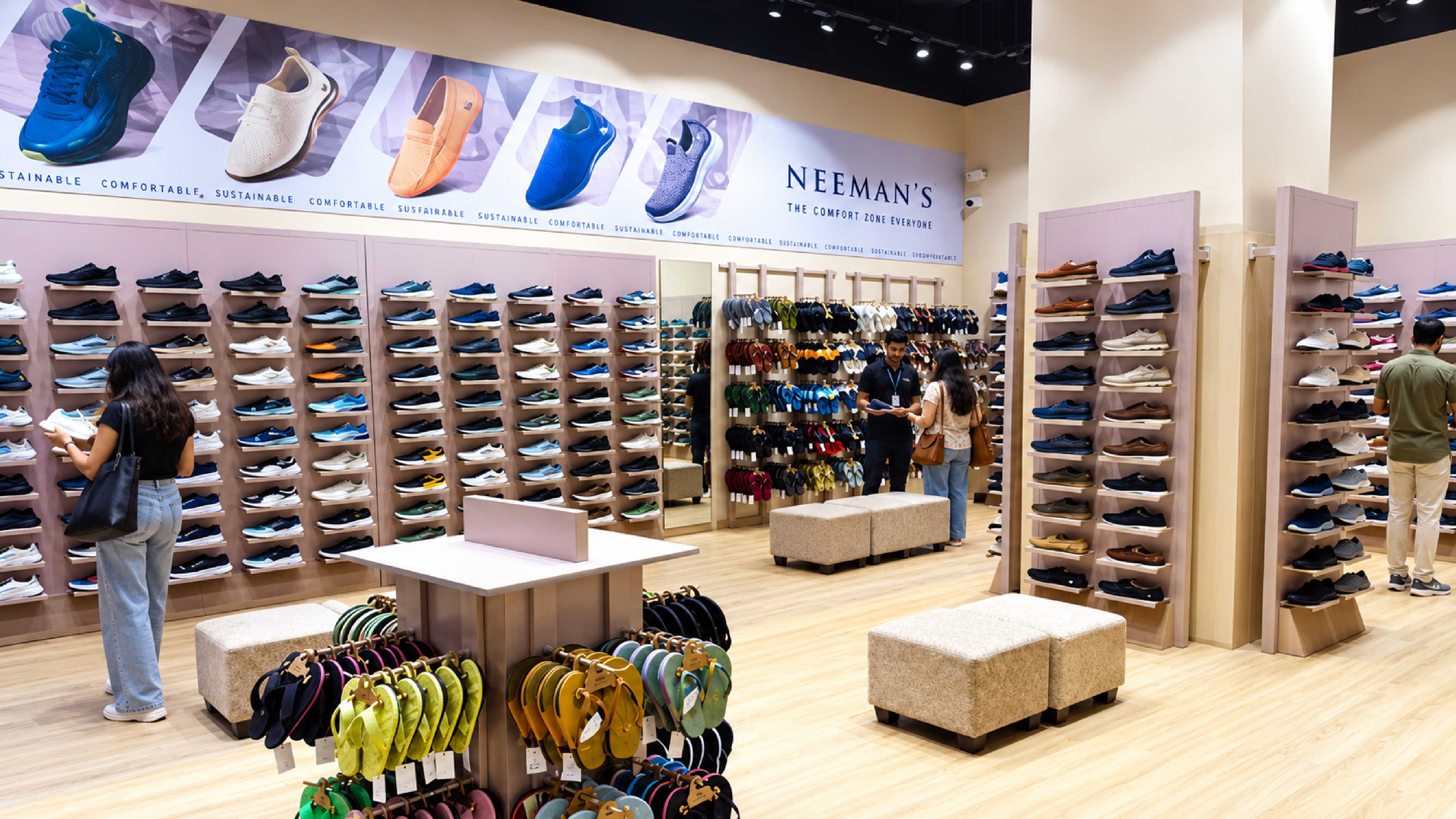
For Neeman's, the challenge takes a different shape. A digital identity built around simplicity, contemporary design and sustainability has to acquire physical equivalents. Those qualities have to find expression through materials, signage, fixtures, displays and finishes. The store becomes another place where the brand's visual and functional choices are interpreted.
In both cases, the physical environment extends a relationship that already exists. The store therefore has to carry recognition forward while giving the brand a new physical language.
This is why the move from D2C to physical retail is more than a channel expansion. It is a translation exercise.
How Digital Brand Identity Becomes Physical Through Store Branding
Digital environments give brands a remarkable degree of control because the conditions around the identity can be managed as carefully as the identity itself. A colour sits against a chosen background, typography is viewed at a predictable scale and photography arrives inside a frame that has already been designed. Even the space around the brand can be controlled or removed altogether.
A physical store takes those decisions into a less predictable environment. The colour now sits on a painted wall or fabricated surface, the typeface may become dimensional lettering, and photography or graphics have to contend with reflections, shadows, surrounding materials and the movement of people through the space. The identity is still the same, but the conditions around it have changed.
That difference becomes particularly clear when materials move from sample review to the finished environment. A metallic finish can look restrained when viewed as a small sample under office lighting, then become considerably more reflective when fabricated across a larger surface beneath strong retail illumination. What looked like a quiet material choice can suddenly become one of the most visually dominant elements in the space.
The same can happen with typography. A thin typeface may retain its elegance on screen while becoming harder to read when translated into dimensional letters at a particular size. Letter depth, viewing distance and illumination begin influencing how the identity is perceived. A decision that once belonged to graphic design has become a question of fabrication and environment.
This is where Store Branding moves beyond applying existing assets. The identity has to be interpreted for the conditions in which customers will actually encounter it, because physical application introduces variables that a digital guideline can describe but cannot fully control.
Why Retail Signage Has To Do More Than Display A Logo
The transition becomes particularly visible in Retail Signage. On a screen, a logo exists within a controlled composition. On a storefront, it competes with architecture, neighbouring businesses, road traffic, lighting, building proportions and viewing distance.
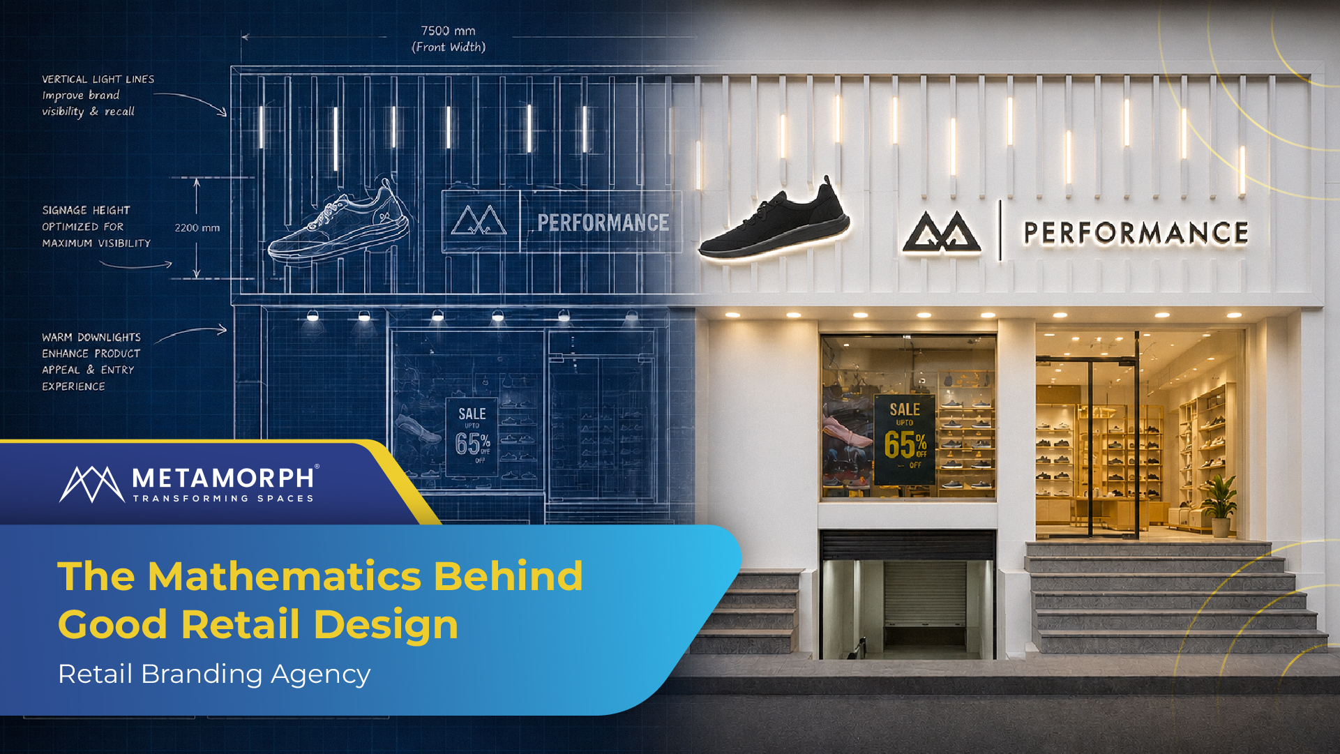
A digital-first brand may have spent considerable time refining the spacing, proportions and visual weight of its identity. When that identity becomes a fabricated sign, those decisions acquire physical consequences. A powder-coated metal letter has a different presence from an acrylic letter, while halo illumination creates a different effect from face illumination. The depth of a letter changes its shadow and edge definition, and the size of the sign determines how much of the identity can be read from the approach to the store.
The façade becomes part of that reading too. A carefully developed identity can lose some of its character when the signage becomes too small against the architecture, the material feels disconnected from the brand, or illumination alters the intended colour relationship.
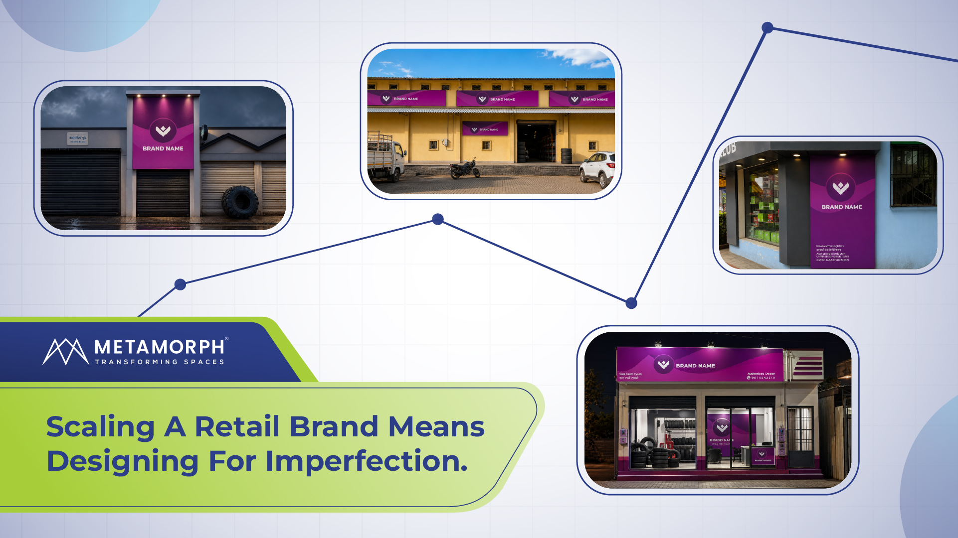
The challenge becomes especially visible across multiple locations. A high-street storefront, mall unit and projecting sign may require different physical solutions while customers still need to recognise the same brand.
A signage system therefore has to interpret the identity across different physical conditions. The logo remains familiar, while its physical expression adapts to the place in which it appears.
How In-Store Branding Makes A Physical Brand Feel Consistent
The storefront creates the first physical impression. The interior has to sustain it.
This is where In-Store Branding becomes more than adding graphics to walls.
Take a brand whose digital presence is deliberately minimal. Carrying that character into a store may mean using fewer, more deliberate communication points, carefully selected materials and fixtures with clean proportions. The restraint has to survive physical scale and customer movement.
A brand with a more energetic visual identity may carry that energy through colour blocking, graphics, display structures or Digital Signage while maintaining a clear hierarchy between communication and product.
Furniture & Fixtures carry this language as well. A fixture has a functional job: it holds, displays or organises a product. Its proportions, edge treatment, materials and detailing also contribute to the character of the environment. For a D2C brand with a strong visual identity across packaging and digital channels, these physical details become another point of connection between the product and its surroundings.
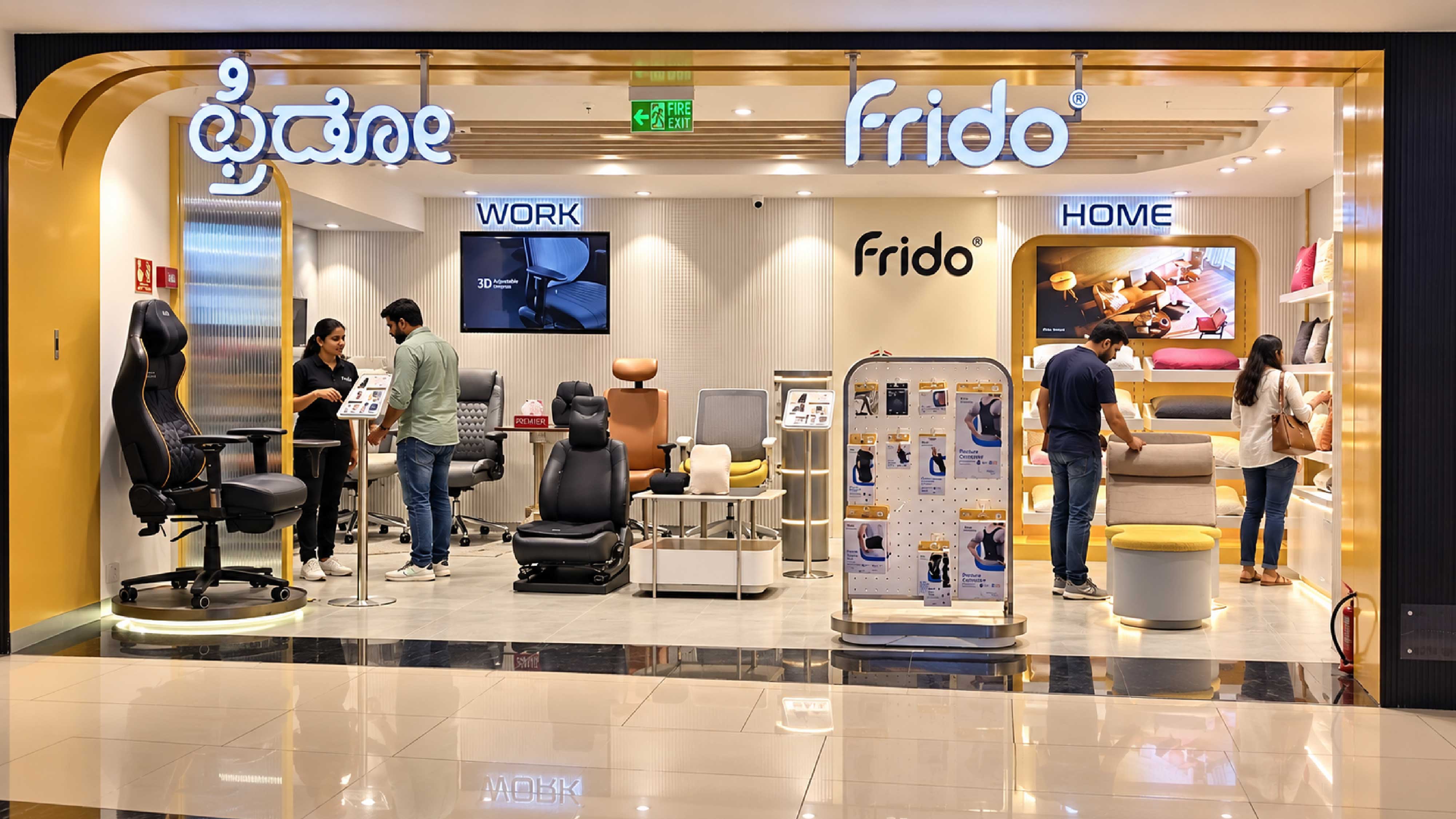
The store starts feeling coherent when these decisions reinforce the same identity. Signage relates to the fixtures, materials support the visual language, graphics have a clear relationship with the environment, and digital elements sit within the same hierarchy.
The brand becomes something customers experience throughout the space rather than something they encounter only on the logo.
Why Retail Branding Has Different Rules From Digital
There is a temptation when taking a digital-first brand offline to reproduce the digital identity as literally as possible. Yet the website and the store operate under fundamentally different conditions, which means the same identity has to behave differently in each environment.
A website controls the frame. The customer sees exactly the composition the brand has designed. A store has to work from the street, from the entrance, from the side of a fixture and from several points within the space. A message that sits perfectly beside a product on a screen may be approached from an angle in a store, partially obscured by another display or encountered while the customer is moving through the space.
Scale changes that relationship further. A digital asset can be resized instantly, while a physical sign, fixture or graphic has already been fabricated. Its proportions have to work within the architecture and remain legible at the distances at which customers encounter it. The physical environment also determines what sits around that element, so the brand has to account for hierarchy across the entire space rather than within a single frame.
That makes physical consistency a different exercise from visual repetition. The goal is to understand which signals make the brand recognisable and then give those signals enough flexibility to work across different conditions.
For one brand, colour may carry most of that recognition. For another, material restraint may matter more. A third may depend heavily on the proportions of its signage or the structure of its product displays.
The role of Retail Branding is to identify those signals and translate them into a physical system that can adapt without losing its identity.
The First Store Reveals What The Brand Really Owns
Digital brand guidelines often contain a long list of things a brand controls: colour, typography, logo usage, imagery, tone and graphic elements. Physical retail forces a more useful question:
Which of these actually need to survive when the brand enters the real world?
Perhaps the strongest recognition comes from colour rather than typography. Perhaps material quality is central to how the brand wants to be perceived. Perhaps the storefront needs to carry most of the recognition while the interior can remain quieter. A particular fixture or display format may become so closely associated with the brand that it deserves to become part of the wider Store Branding system.
These decisions matter when the brand moves beyond its first few locations.
A Retail Rollout becomes easier to manage when the physical identity has already been understood as a system. Teams know what needs to remain consistent and where the environment can adapt. Signage can respond to different façades while retaining recognition. In-Store Branding can change with the format while preserving the same underlying identity.
The first store, in that sense, becomes a place where the physical rules of the brand begin to reveal themselves.
From Digital Identity To A Physical Retail Brand
The most interesting part of a digital-first brand entering physical retail is the additional way in which customers can recognise it.
A customer who knew the brand through Instagram can now recognise its signage from the street. Someone who knows its packaging can encounter the same visual language through a fixture. A colour that once existed on a screen can become part of a physical environment. A proposition communicated through digital content can now be reinforced through what the customer sees, touches and moves through.
That shift gives physical retail a particular role in brand-building. It exposes the decisions that digital environments can keep carefully controlled: whether a material holds up under actual lighting, whether typography remains legible at distance, whether signage has enough presence against architecture, and whether the details across the space actually belong to the same brand.
For a D2C brand, the first store therefore becomes more than another customer touchpoint. It becomes a test of which parts of its identity have enough substance to survive outside the screen.
The brands that handle this transition well are the ones that understand their physical identity as a system of decisions rather than a collection of applications. When colour, material, signage, fixtures and communication are designed to work together, the brand can enter a new physical context and still be recognised for the same reasons it was recognised online.
That is the real shift from digital recognition to physical recognition: the brand stops being something customers only see and becomes something the environment itself can communicate.